Tap to
TOUCh
Bridging Physical and Digital for a Smarter User Experience
Bridging Physical and Digital for a Smarter User Experience
Tap to
TOUCh
01.
Overview
In compliance with my confidentiality agreement, I have omitted and altered any confidential details.
My Role
Product Designer
Product Designer
TEAM
1 PM (HQ), 4 Industrial Designer (HQ),
2 Industrial Engineers (HQ),
2 Software Engineers (HQ)
REGIONS
Korea, Seoul
US, New Jersey
Korea, Seoul
US, New Jersey
SKILLS
Product Design
Stakeholder Management
Interactive Prototyping
User research & testing
Product Design
Stakeholder Management
Interactive Prototyping
User research & testing
DURATION
Mar- Dec 2023
Mar- Dec 2023
Shipped
Redesigning the LG vacuum experience by aligning hardware and app UI to improve usability, reduce friction, and build user trust.
Shipped
01.
Overview
In compliance with my confidentiality agreement, I have omitted and altered any confidential details.
Redesigning the LG vacuum experience by aligning hardware and app UI to improve usability, reduce friction, and build user trust.
02.
Problem
A good vacuum, misunderstood.
Despite strong specs, users perceived LG’s vacuum as underperforming.
The real issue? Poor communication through the physical UI and a disconnected mobile app. Maintenance steps were unclear, setup was tedious, and users lost trust in both the product and the brand.
03.
Goal
Goal
Redesign the user experience to rebuild trust in the vacuum’s physical UI and mobile app, helping users get more value from both while increasing app engagement and strengthening brand perception.
Redesign the user experience to rebuild trust in the vacuum’s physical UI and mobile app, helping users get more value from both while increasing app engagement and strengthening brand perception.
04.
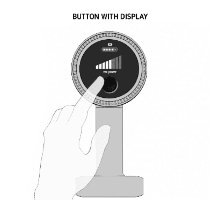
Research
Confusing
power settings
Maintenance
notification visibility
Ambiguous
UX writing
Information
overload
Confusing
power settings
Maintenance
notification visibility
Ambiguous
UX writing
Information
overload
Product Audit & Contextual Interview
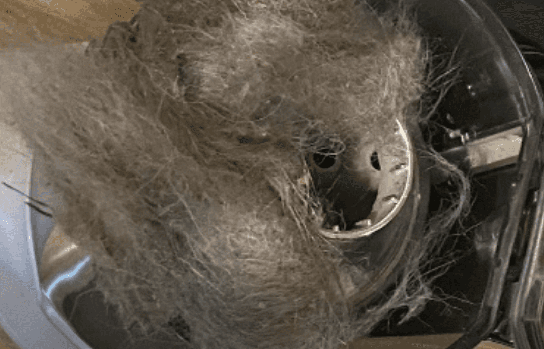
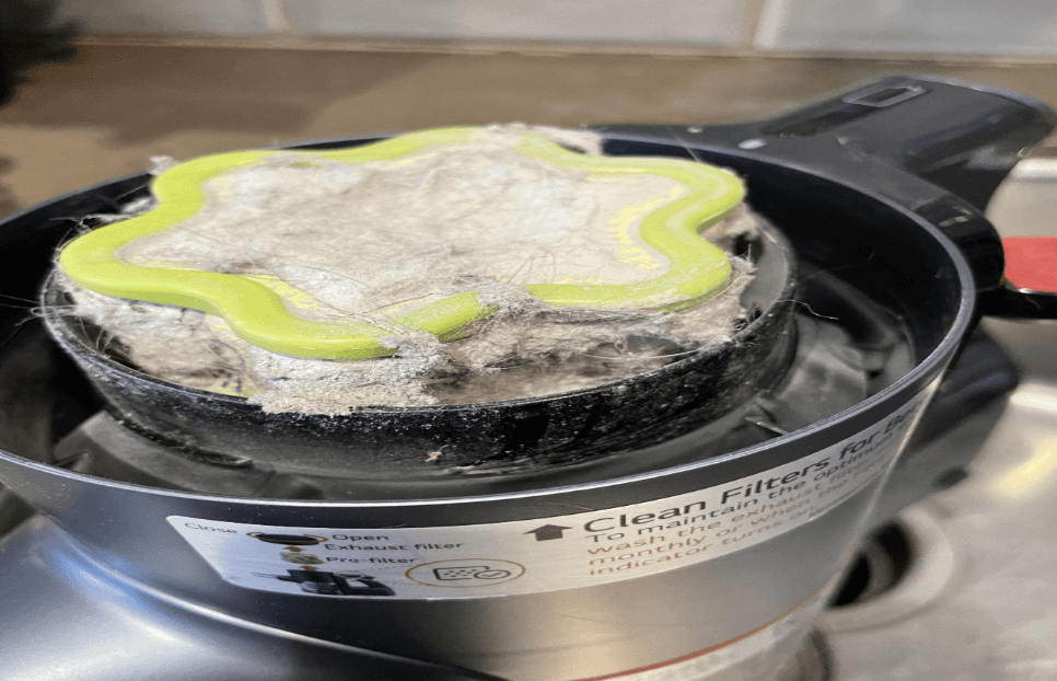
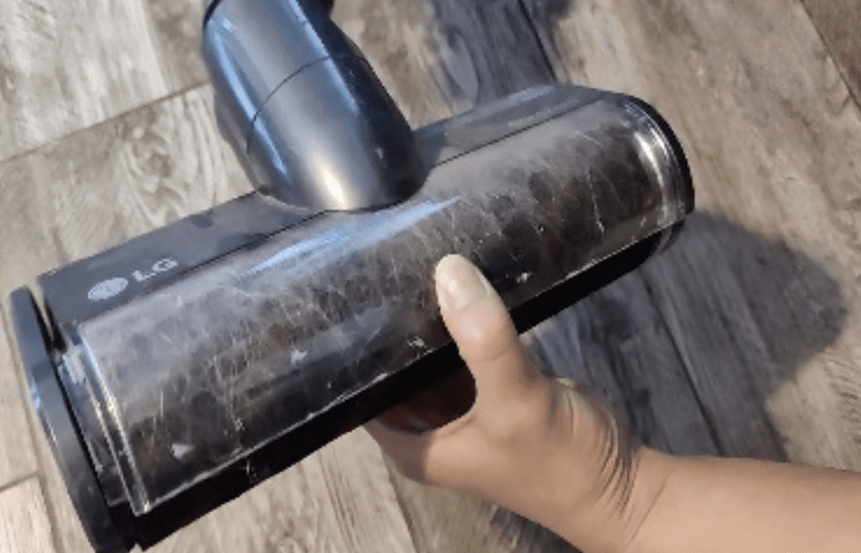
To uncover the root issues, I led contextual interviews at LG’s R&D center in Chicago. I observed how users interacted with the product, audited the physical UI, and identified friction points like vague labels, notification visibility, and overloaded buttons.
Consumer Survey
12%
(14 out of 113)
14%
(16 out of 113)
27%
(31 out of 113)
46%
(52 out of 113)
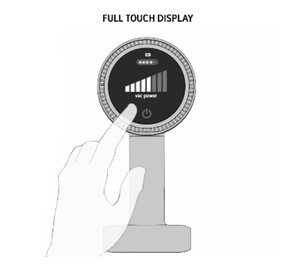
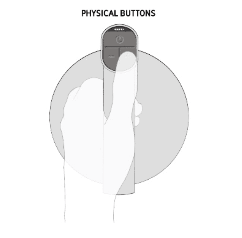
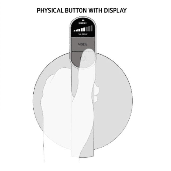
Screen and Button Combination
Surveys with 113 respondents showed a strong preference for a hybrid UI (screen + analog) due to clarity and ease of use.
Mobile Connection Audit
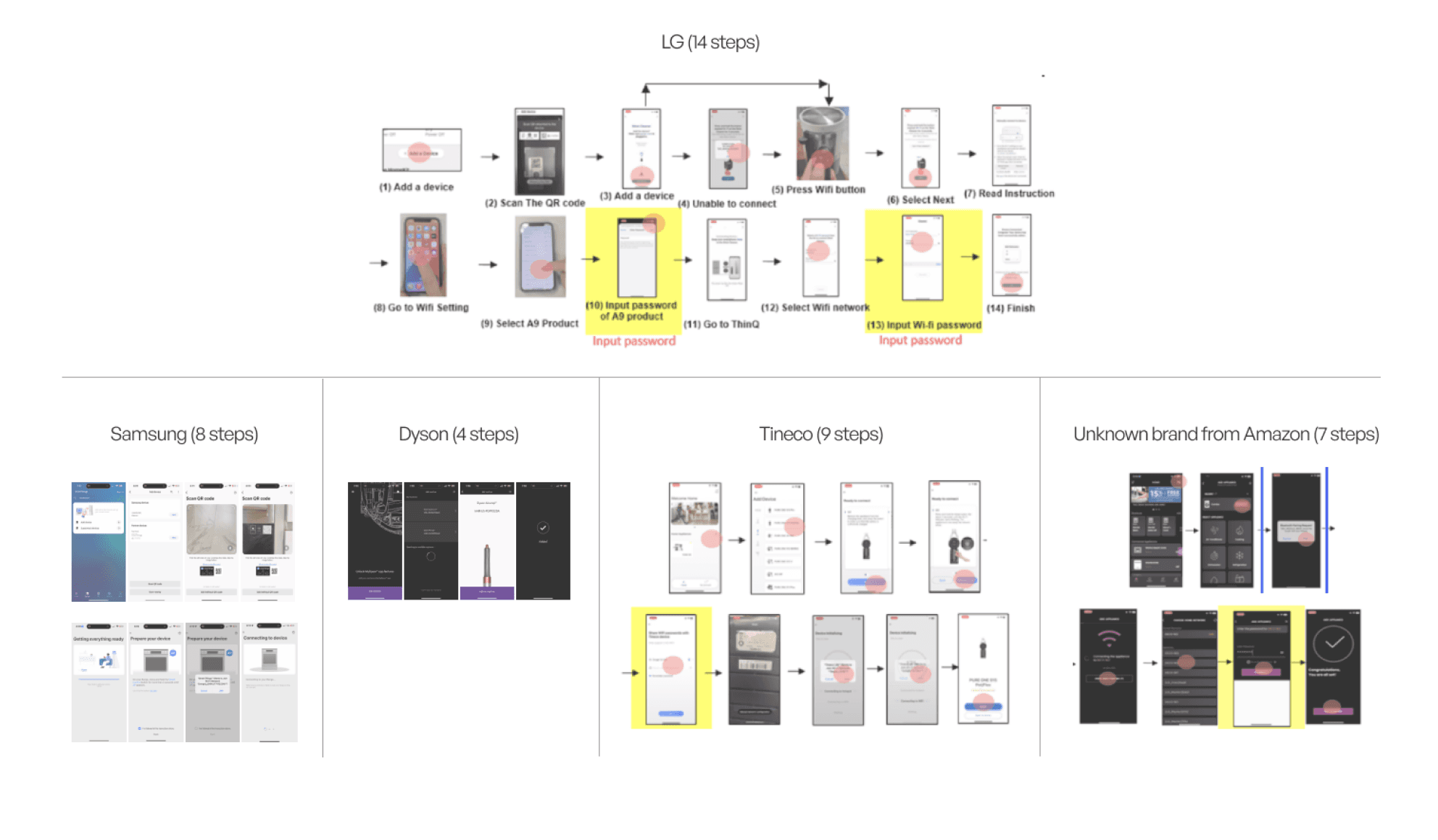
A competitive audit revealed LG’s setup process required the most back-and-forth between device and app.
App User Review
“Who uses an app while vacuuming??”
App User Review
“Setting up took about 15 minutes and 2 tries to finally connect to the product.”
App User Review
“The app stores cleaning history and that’s about it, totally not worth the time I spent setting up”
Product User Review
“I never know how much battery I have left”
Product User Review
“How are you supposed to know what power setting you are on?”
Product User Review
“Is there a way to reach the turbo setting? how?”
Product User Review
Worst experience ever! At this point, it’s making me rethink having LG products altogether.
Review scraping from 5,000+ app reviews highlighted a clear user expectation:
Essential info like battery or filter status should live on the device, not the app. Instead, users wanted the app to offer post-cleaning features like filter tracking and accessory support.
05.
Design Focus
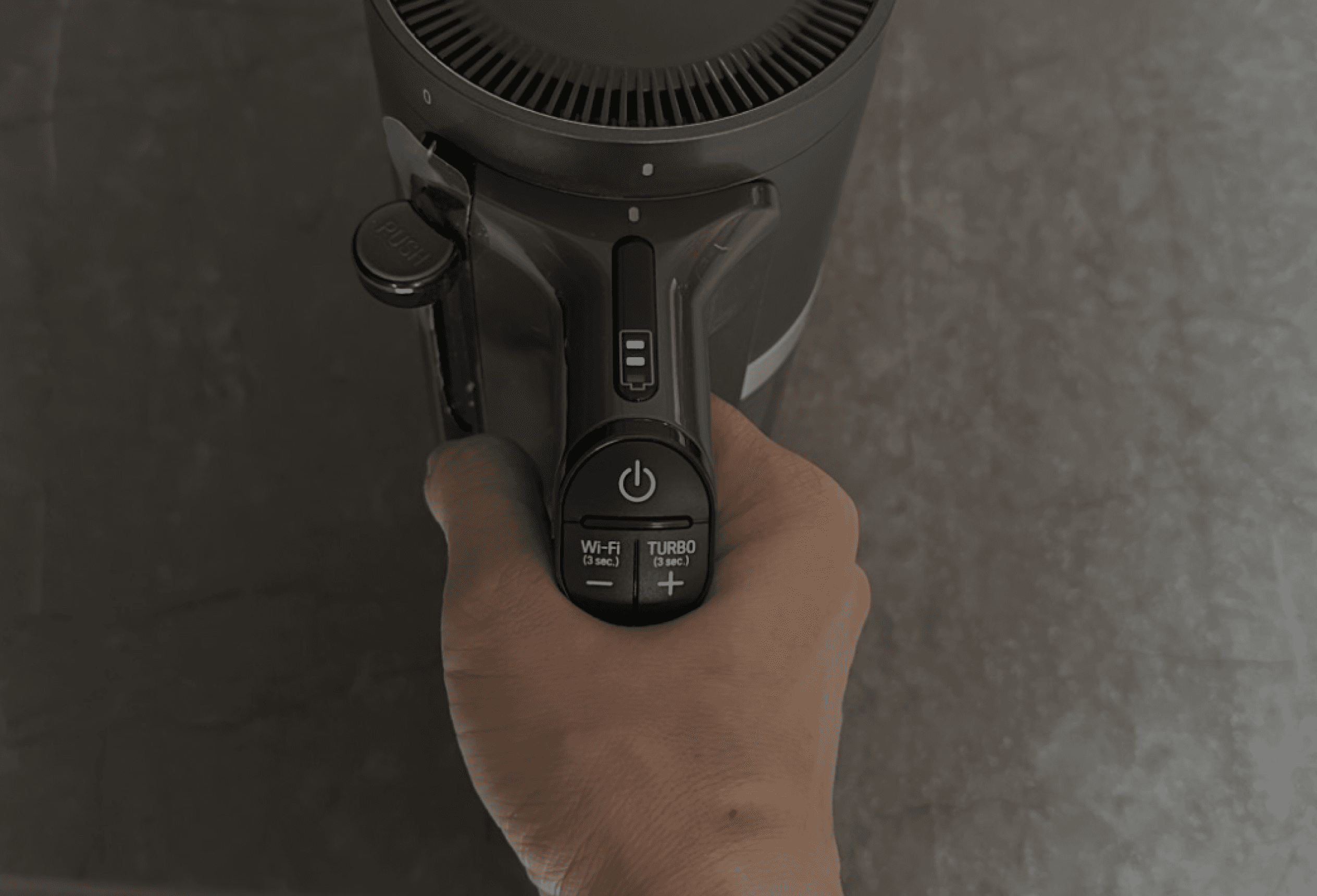
Product UI
Mobile App
Improve on-device clarity ane embed essential real-time data.
Simplify setup, enhance functionality, and create long-term value for users.
Common:
Reduce Steps
Surface key data
Align hardware and software
Make features feel “smart” not hidden
I focused on two parallel tracks:
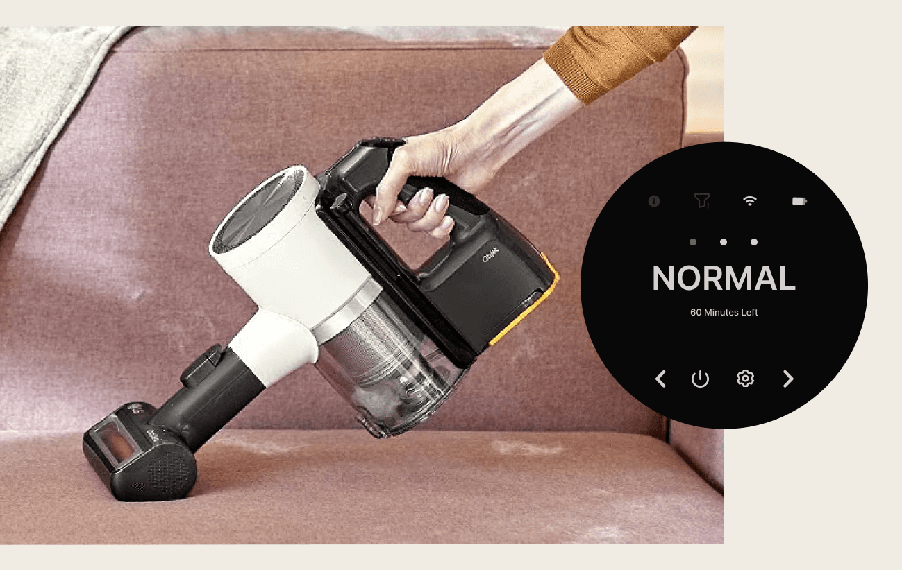
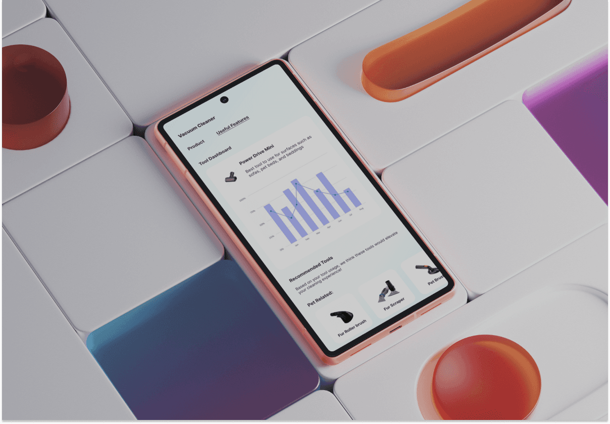
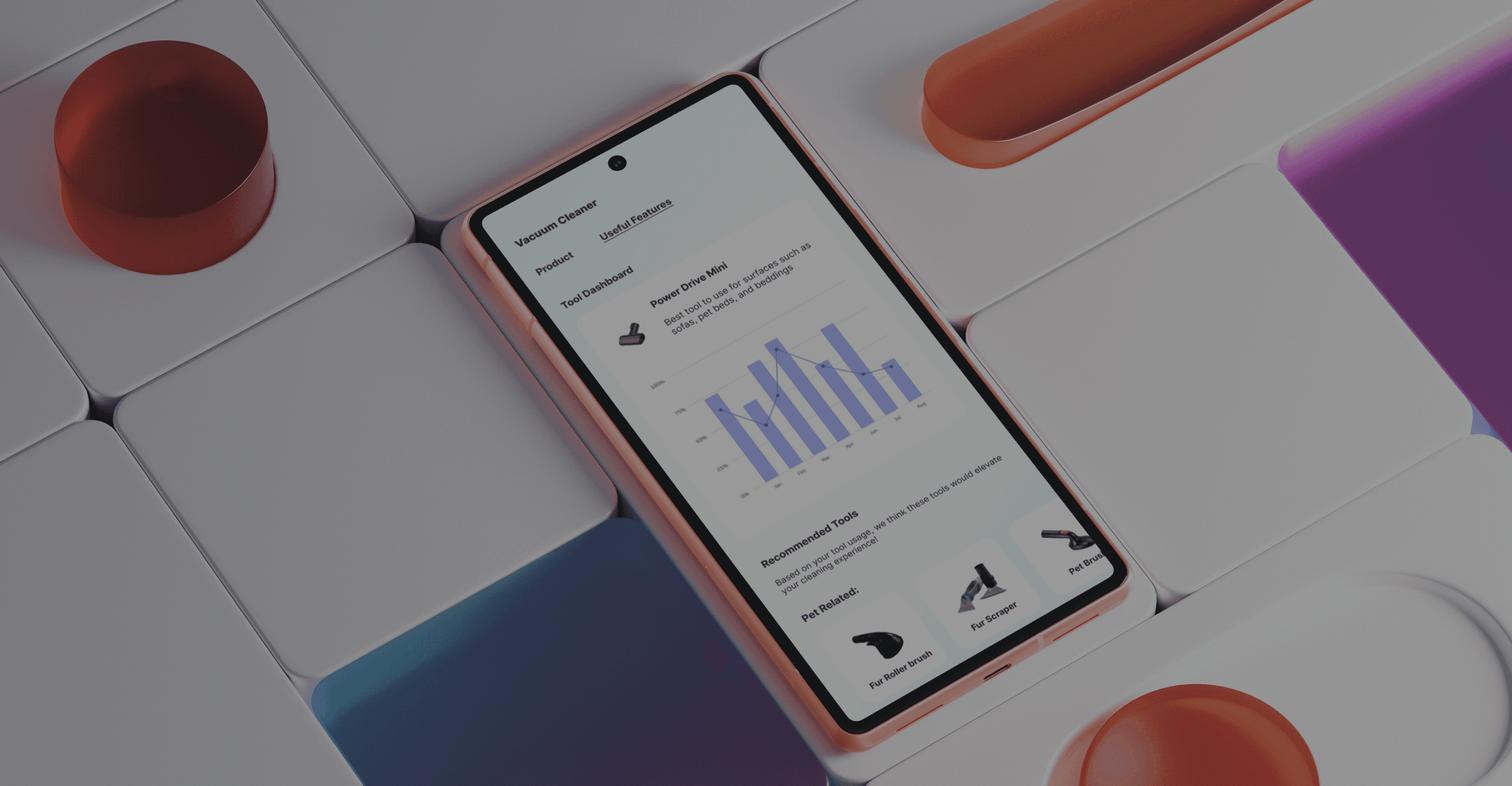
Simplified the UI by Clarifying icons, labels, and surfaced feedback like filter status. Reduced user guesswork and made core functions easier to access without relying on the app.
Product UI
06.
Solutions
Simplified
Connection
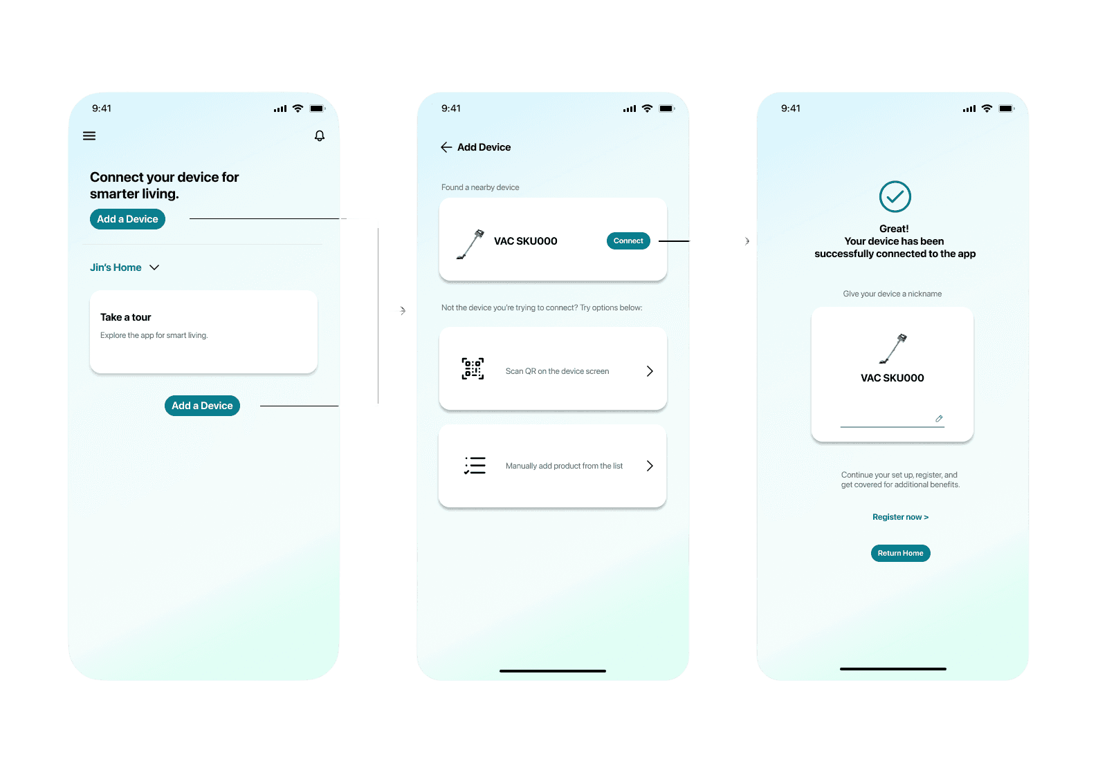
Collaborated with engineers to integrate Bluetooth pairing. The 14-step setup process became just 3 steps, dramatically improving onboarding.
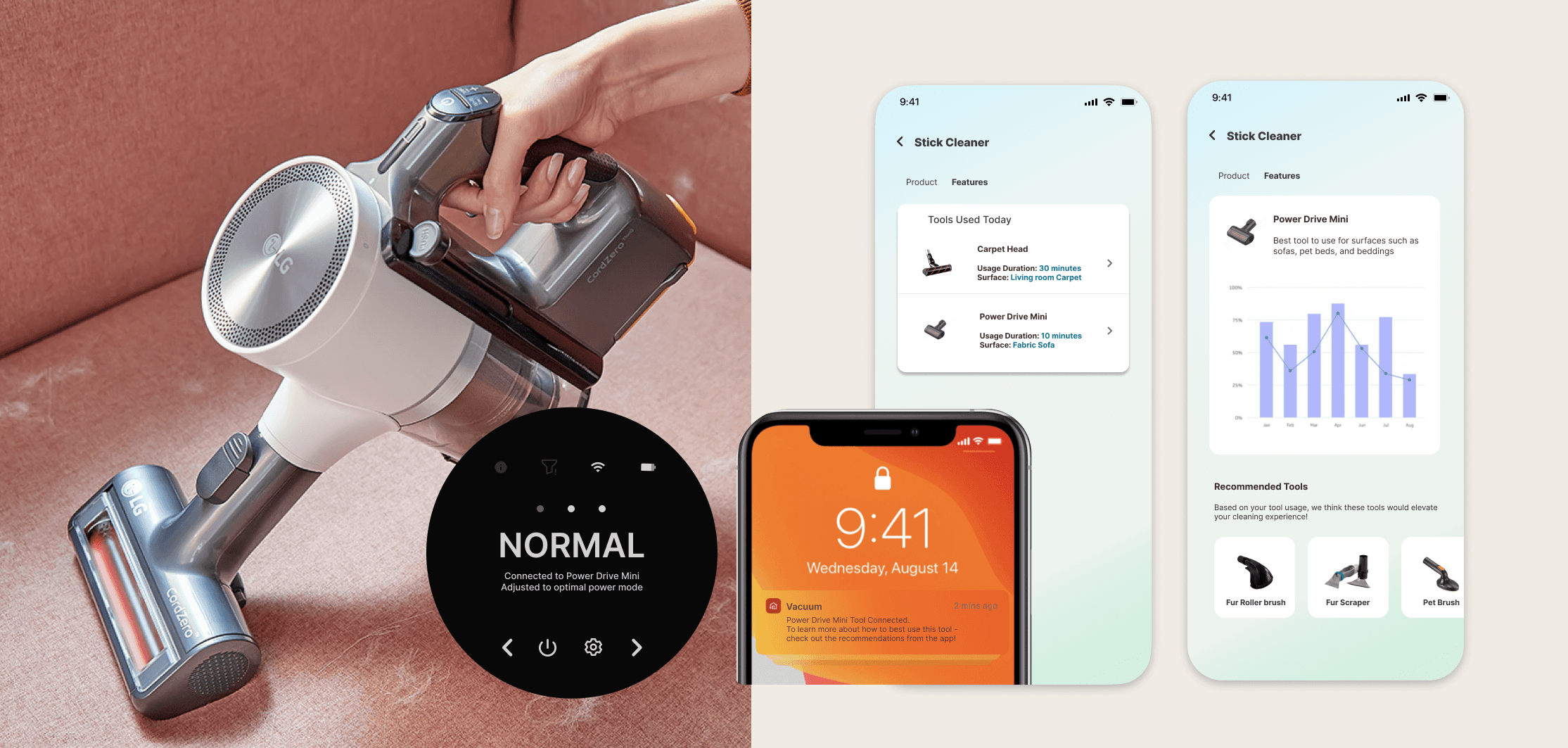
Accessory Tracker
Explored RFID tracking to monitor the tool usage to allow the app to offer personalized tips and increase engagement with underused features.

Maintenance
Tracker
Introduced a feature that provides predictive tracking + alerts based on sensor inputs
07.
User Testing
100%
of testers found filter tracker valuable
100%
Users said ability to shop directly from the app through a link made it easier to understand that purchasing filters were mandatory
Tested mobile and product UI prototypes with 10 current LG vacuum users.
70%
said accessory tracker improved tool understanding
08.
Recognition
& Outcomes
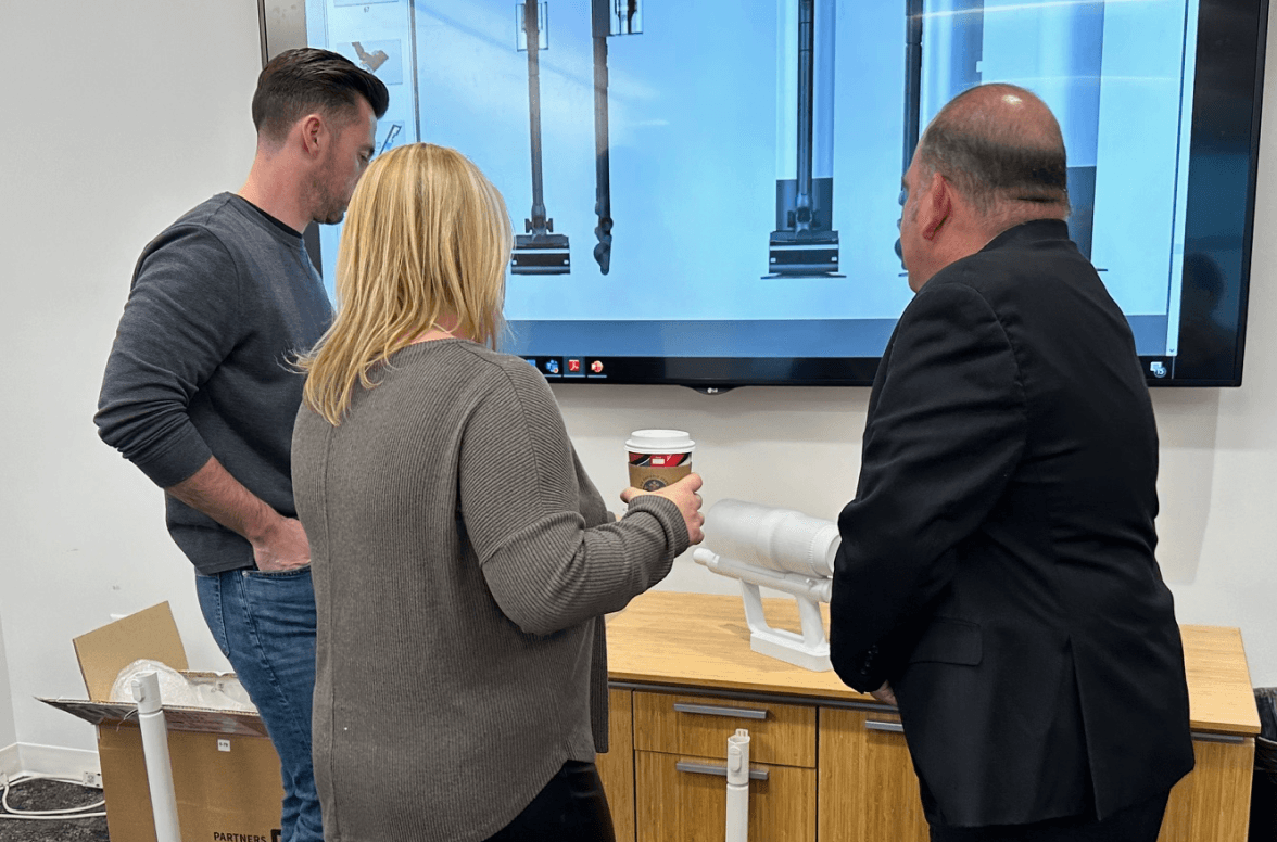
In December 2023, I was invited to LG HQ in Korea to present my findings. I proposed integrating mobile design earlier in the product cycle to close the gap between product and digital experiences. While the proposal wasn’t implemented immediately, leadership praised the concept as a model for future cross-platform collaboration.
09.
Reflection
This project taught me how to navigate complex org structures and bring alignment between siloed teams. One key challenge was integrating mobile features into a hardware-first process—by pushing for early involvement, I helped create a more cohesive user experience. It also reinforced the importance of translating user pain points into scalable solutions that align with business goals.
What I’m most proud of is stepping beyond my original scope. By identifying overlooked user issues and proposing new ideas, I contributed to a broader product vision aligned with LG’s smart home strategy.
04.
Research
Maintenance notification visibility
Ambiguous UX writing
Information overload
Confusing power settings
Product Audit & Contextual Interview
To uncover the root issues, I led contextual interviews at LG’s R&D center in Chicago. I observed how users interacted with the product, audited the physical UI, and identified friction points like vague labels, notification visibility, and overloaded buttons.
Consumer Survey
12%
(14 out of 113)
14%
(16 out of 113)
27%
(31 out of 113)
46%
(52 out of 113)
Screen and Button Combination
Surveys with 113 respondents showed a strong preference for a hybrid UI (screen + analog) due to clarity and ease of use.
Mobile Connection Audit
A competitive audit revealed LG’s setup process required the most back-and-forth between device and app.
App User Review
“Who uses an app while vacuuming??”
App User Review
“Setting up took about 15 minutes and 2 tries to finally connect to the product.”
App User Review
“The app stores cleaning history and that’s about it, totally not worth the time I spent setting up”
Product User Review
“I never know how much battery I have left”
Product User Review
“How are you supposed to know what power setting you are on?”
Product User Review
“Is there a way to reach the turbo setting? how?”
Product User Review
Worst experience ever! At this point, it’s making me rethink having LG products altogether.
Review scraping from 5,000+ app reviews highlighted a clear user expectation:
Essential info like battery or filter status should live on the device, not the app. Instead, users wanted the app to offer post-cleaning features like filter tracking and accessory support.
05.
Design Focus
Product UI
Mobile App
Improve on-device clarity ane embed essential real-time data.
Simplify setup, enhance functionality, and create long-term value for users.
Common:
Reduce Steps
Surface key data
Align hardware and software
Make features feel “smart” not hidden
I focused on two parallel tracks:
06.
Solutions
Simplified the UI by Clarifying icons, labels, and surfaced feedback like filter status. Reduced user guesswork and made core functions easier to access without relying on the app.
Product UI
Collaborated with engineers to integrate Bluetooth pairing. The 14-step setup process became just 3 steps, dramatically improving onboarding.
Simplified Connection
Accessory Tracker
Explored RFID tracking to monitor the tool usage to allow the app to offer personalized tips and increase engagement with underused features.
Maintenance Tracker
Introduced a feature that provides predictive tracking + alerts based on sensor inputs
07.
User Testing
100%
of testers found filter tracker valuable
100%
Users said ability to shop directly from the app through a link made it easier to understand that purchasing filters were mandatory
Tested mobile and product UI prototypes with 10 current LG vacuum users.
70%
said accessory tracker improved tool understanding
08.
Recognition & Outcomes
In December 2023, I was invited to LG HQ in Korea to present my findings. I proposed integrating mobile design earlier in the product cycle to close the gap between product and digital experiences. While the proposal wasn’t implemented immediately, leadership praised the concept as a model for future cross-platform collaboration.
09.
Reflection
This project taught me how to navigate complex org structures and bring alignment between siloed teams. One key challenge was integrating mobile features into a hardware-first process—by pushing for early involvement, I helped create a more cohesive user experience. It also reinforced the importance of translating user pain points into scalable solutions that align with business goals.
What I’m most proud of is stepping beyond my original scope. By identifying overlooked user issues and proposing new ideas, I contributed to a broader product vision aligned with LG’s smart home strategy.
OTHER PROJECTS

OTHER PROJECTS