
Chronicle
Reducing No-Shows for Virtual Care Through Strategic UX
Reducing No-Shows for Virtual Care Through Strategic UX
Chronicle
Chronicle
Reducing No-Shows for Virtual Care Through Strategic UX
Reducing No-Shows for Virtual Care Through Strategic UX
Chronicle
In compliance with my confidentiality agreement, I have omitted and altered any confidential details.
My Role
UX Designer
TEAM
1 UX Designer
2 Clinical Researchers
FOCUS
UX Research
Service Design
Patient journey mapping
UX proposal
DURATION
Spring 2021
In the early stages of NYC’s COVID-19 response, Columbia’s orthopedic department rapidly transitioned to virtual care. As no-show rates for virtual visits climbed past 35%—with nearly half of patients struggling to connect—our team was tasked with uncovering the causes behind patient drop-offs and crafting UX recommendations that could restore trust and continuity of care.
Delivered
01.
Overview

02.
Rising number
of “NO-SHOWS”
Virtual care introduced friction across the entire patient journey. Patients struggled to register, complete pre-visit tasks, and connect with doctors. The process felt disjointed and unsupported, leading to frustration and missed appointments.
In the first two months, no-show rates for virtual appointments exceeded 35%,
and over 45% of attendees faced difficulties connecting.
03.
Goal
The objective was to investigate the full end-to-end experience of virtual visits—from sign-up to post-appointment—and uncover specific UX barriers contributing to high no-show rates. By identifying friction points like missed communications, confusing pre-visit steps, and technical obstacles, the goal was to deliver actionable design proposals that could increase patient attendance, reduce frustration, and restore confidence in remote care delivery.
04.
Research &
Insight
Patient Survey
25 No Show
25 Visit Completed
Total 50 Patients
The survey aimed to gather insights into where roadblocks typically occurred, the points at which patients gave up, and any steps they attempted to take in order to resolve issues and meet with the doctor.
Difficulty setting up application
Pre-visit tasks
confusion
Pre-visit paperwork
confusion
Confused
when in the
virtual visit room
48 out of 50
46 out of 50
45 out of 50
41 out of 50
The sign-up audit revealed why users were dropping early in the journey: too many steps, inconsistent navigation, and unclear language in the verification flow created immediate friction
UX Audit
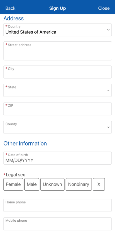
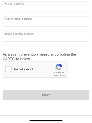
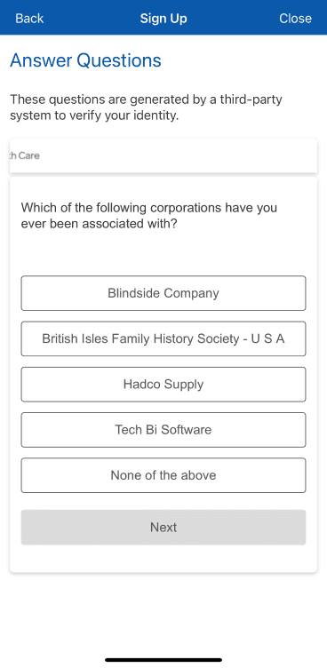
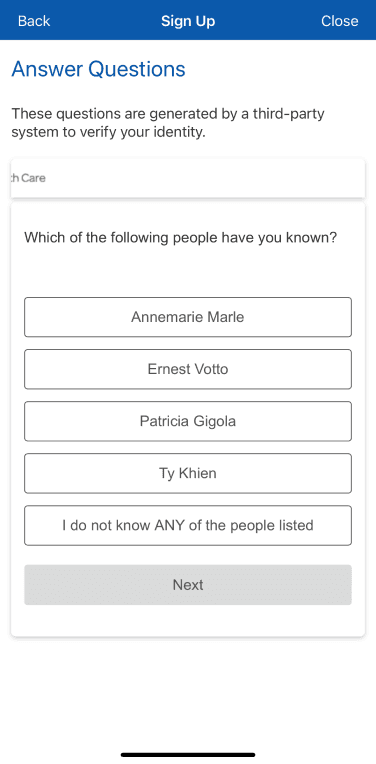
Lengthy question fields and multi-step verification process requiring information that was difficult to recall.
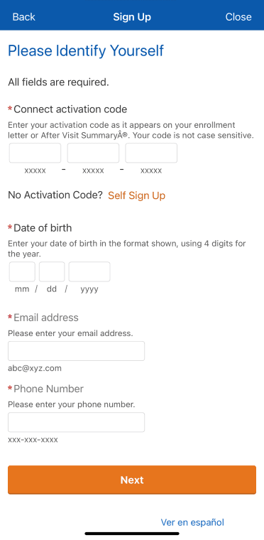
Most patients didn’t receive an activation code
The self-sign-up option hidden

Sign up without activation code," the description was very lengthy.
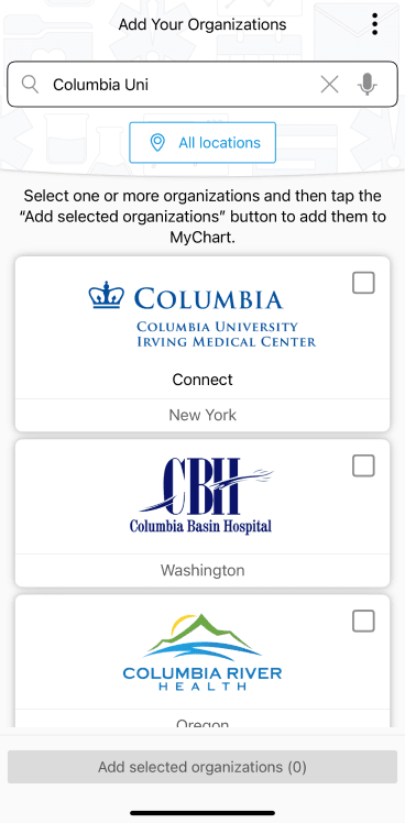
Patients did not know the exact institution name to search for.
Journey Mapping
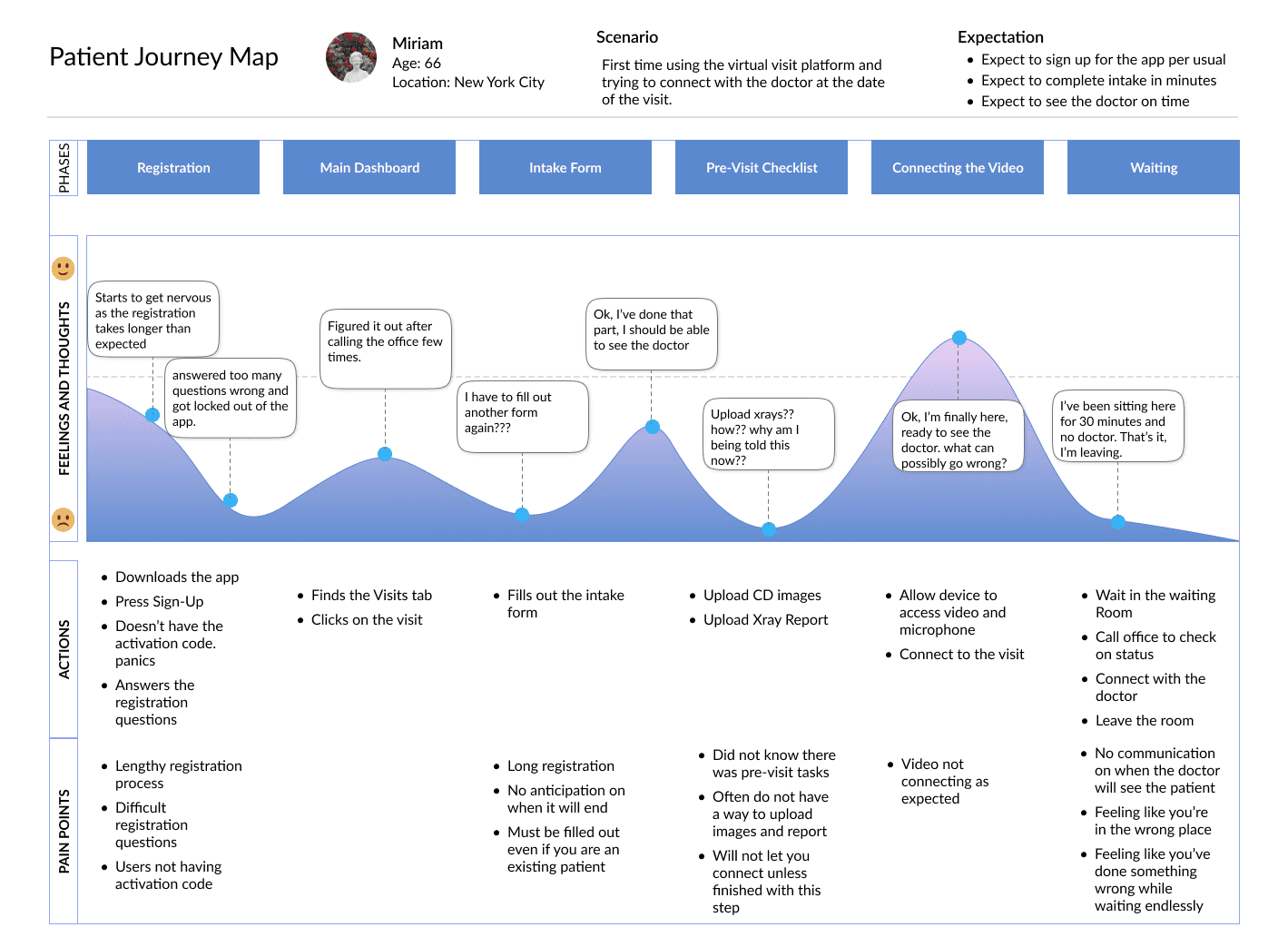
Journey mapping surfaced the three most impactful breakdowns:
Complex registration with lengthy verification
Missed or overlooked pre-visit tasks
Silence and uncertainty in the virtual waiting room
To determine if these challenges were specific to orthopedic patients, additional interviews with 10 patients were conducted from different departments who had recently completed virtual visits, aiming to validate our survey findings.
User Interviews


Interviews with patients across departments revealed a deeper emotional layer—frustration, helplessness, and confusion during critical moments.
To address all low points in the user experience, I envisioned an ideal user flow that would align more closely with user expectations for a "smooth visit process."

FEARLESS TRAVELLER
Age: 34
Gender: Male
Location: Grand Rapids, MI
Occupation: Project Manager
Family Status: Married with two children (ages 6 and 8)
Jared
FEARLESS TRAVELLER
Age: 34
Gender: Male
Location: Grand Rapids, MI
Occupation: Project Manager
Family Status: Married with two children (ages 6 and 8)
Jared
Based on the flow, three targeted improvements were proposed to reduce friction and rebuild patient confidence:
Simple Sign-up
Integrated Pre-Visit Task List
Virtual Waiting Room Communication
User Flow
Simplified Sign-up
Replaced dense, multi-field forms with step-by-step input screens and visible progress indicators. Outdated ID verification was replaced with a familiar phone-based confirmation flow. UX writing was simplified for clarity and ease.
05.
Proposal
Integrated
Pre-visit Tasklist
Task lists—previously buried in emails—were brought directly into the app. Patients could now view and complete requirements like forms and uploads within the appointment screen, days in advance.
Virtual Waiting Room
Communication
To reduce abandonment during long wait times, an in-app messaging feature allowed real-time communication between clinic staff and patients, reducing uncertainty and missed visits.
06.
Results &
impact
Two of the three recommendations were implemented by the platform provider. Within weeks, key metrics began to improve:
20%
reduction in sign-up completion time
15%
decrease in missed appointments
25%
of patients reported a clearer experience
87%
increase in pre-visit task completion
07.
Reflection
This project reinforced that no-show rates weren’t about apathy—they were about broken systems. By listening closely to patients and mapping every touch point, we uncovered simple, impactful ways to reduce confusion and help people follow through on care.
While my work focused on research and proposal, it sparked a lasting interest in designing for health systems—especially where digital gaps intersect with moments of vulnerability.
01.
Overview
In compliance with my confidentiality agreement, I have omitted and altered any confidential details.
My Role
UX Designer
TEAM
1 UX Designer,
2 Clinical Researchers
FOCUS
UX Research,
Service Design,
Patient Journey Mapping,
UX Proposal,
DURATION
Spring 2021
Shipped
In the early stages of NYC’s COVID-19 response, Columbia’s orthopedic department rapidly transitioned to virtual care. As no-show rates for virtual visits climbed past 35%—with nearly half of patients struggling to connect—our team was tasked with uncovering the causes behind patient drop-offs and crafting UX recommendations that could restore trust and continuity of care.
Delivered
02.
Rising number of “NO-SHOWS”
Virtual care introduced friction across the entire patient journey. Patients struggled to register, complete pre-visit tasks, and connect with doctors. The process felt disjointed and unsupported, leading to frustration and missed appointments.
In the first two months, no-show rates for virtual appointments exceeded 35%,
and over 45% of attendees faced difficulties connecting.
03.
Goal
The objective was to investigate the full end-to-end experience of virtual visits—from sign-up to post-appointment—and uncover specific UX barriers contributing to high no-show rates. By identifying friction points like missed communications, confusing pre-visit steps, and technical obstacles, the goal was to deliver actionable design proposals that could increase patient attendance, reduce frustration, and restore confidence in remote care delivery.
04.
Research & Insight
The survey aimed to gather insights into where roadblocks typically occurred, the points at which patients gave up, and any steps they attempted to take in order to resolve issues and meet with the doctor.
Patient Survey
Difficulty setting up application
Pre-visit tasks
confusion
Pre-visit paperwork
confusion
Confused
when in the
virtual visit room
48 out of 50
46 out of 50
45 out of 50
41 out of 50
96%
92%
90%
82%
25 No Show
25 Visit Completed
Total 50 Patients
“The first two steps of registering took me 40 minutes...”
“It would not let me get past a screen that asked whole bunch of questions.”
“I’m 76. I’m not sure how you expect me to fill out a form with itty bitty texts.”
“I was staring at the blank screen for 30 min, I didn’t know how long I had to wait so I left.”
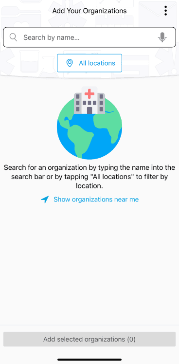

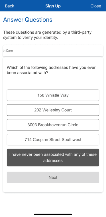
Patients did not know the exact institution name to search for.
Sign up without activation code," the description was very lengthy.
Most patients didn’t receive an activation code
The self-sign-up option hidden
Lengthy question fields followed by a multi-step verification process requiring information that was difficult to recall.
The sign-up audit revealed why users were dropping early in the journey: too many steps, inconsistent navigation, and unclear language in the verification flow created immediate friction
UX Audit
Journey mapping surfaced the three most impactful breakdowns:
Complex registration with lengthy verification
Missed or overlooked pre-visit tasks
Silence and uncertainty in the virtual waiting room
Journey Mapping
To determine if these challenges were specific to orthopedic patients, additional interviews with 10 patients were conducted from different departments who had recently completed virtual visits, aiming to validate our survey findings.
Interviews with patients across departments revealed a deeper emotional layer—frustration, helplessness, and confusion during critical moments.
User Interviews
Patient Quotes
The intake form felt endless. When I finished the intake,
there was another set of tasks like uploading CDs and reports, so I just gave up and left.
Patient Quotes
The registration, to connecting was hard to figure out from start to finish.
Patient Quotes
I tried calling the office after staring at myself for 35 minutes, then the call dropped and I couldn’t get back in again.
FEARLESS TRAVELLER
Age: 34
Gender: Male
Location: Grand Rapids, MI
Occupation: Project Manager
Family Status: Married with two children (ages 6 and 8)
Jared
I envisioned an ideal user flow that would align more closely with user expectations for a "smooth visit process."
Based on the flow, three targeted improvements were proposed to reduce friction and rebuild patient confidence:
Simple Sign-up
Integrated Pre-Visit Task List
Virtual Waiting Room Communication
User Flow
Simplified Sign-up
Replaced dense, multi-field forms with step-by-step input screens and visible progress indicators. Outdated ID verification was replaced with a familiar phone-based confirmation flow. UX writing was simplified for clarity and ease.
05.
Proposal
Integrated Pre-visit Tasklist
Task lists—previously buried in emails—were brought directly into the app. Patients could now view and complete requirements like forms and uploads within the appointment screen, days in advance.
Virtual Waiting Room Communication
To reduce abandonment during long wait times, an in-app messaging feature allowed real-time communication between clinic staff and patients, reducing uncertainty and missed visits.
06.
Results & impact
Two of the three recommendations were implemented by the platform provider. Within weeks, key metrics began to improve:
20%
reduction in sign-up completion time
15%
decrease in missed appointments
87%
increase in pre-visit task completion
25%
of patients reported a smoother, clearer experience
07.
Reflection
This project reinforced that no-show rates weren’t about apathy—they were about broken systems. By listening closely to patients and mapping every touch point, we uncovered simple, impactful ways to reduce confusion and help people follow through on care.
While my work focused on research and proposal, it sparked a lasting interest in designing for health systems—especially where digital gaps intersect with moments of vulnerability.
OTHER PROJECTS
OTHER PROJECTS
